

Disability signs come in various shapes, sizes and colors, and almost every type of disability or group of disabilities has its own symbol. However, one disability sign speaks accessibility above all others, as it’s become one of our strongest advocates.
When talking about diversity of disability signs, we must mention the crossed-out ear and crossed-out eye signs, symbolizing hearing and sight impairment, respectively. Also common is sign language interpreter symbol with two hands, as well as the sign depicting a man walking with a white cane. There are many other disability signs out there, too, but only one of them became truly universal. It has an interesting origin story to boot.
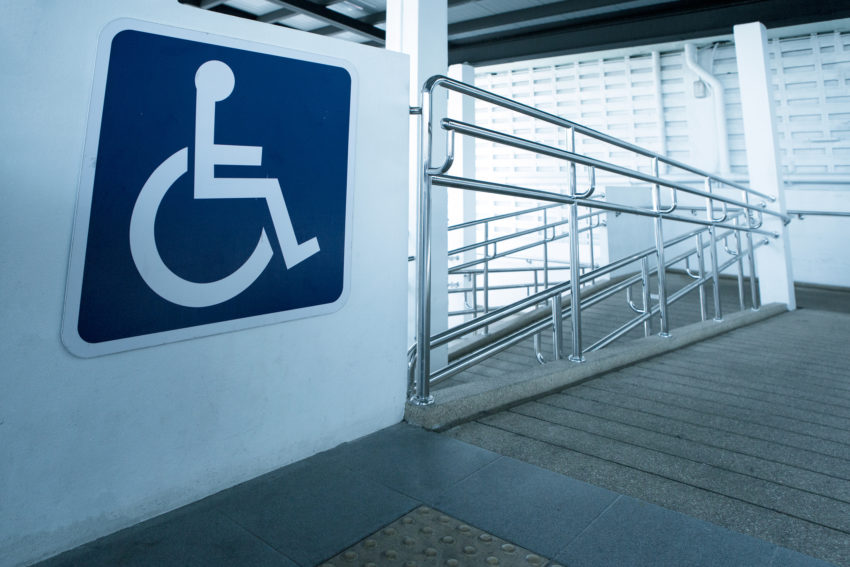
The International Symbol of Access, also known as the (International) Wheelchair Symbol or Accessibility Symbol, in its standard form, consists of a blue square overlaid with a white stylized image of a person in a wheelchair.
A little bit of history
The International Symbol of Access was designed by Danish design student Susanne Koefoed in 1968. Tasked with creating a sign, a symbol to mark accessible accommodations, Koefoed presented an early version of the symbol at the July 1968 exhibition held at the Scandinavian Students Organization’s radical design conference’s end. Koefoed’s symbol originally depicted an empty wheelchair, and this sign was widely promoted around Sweden the following year. Karl Mountain, director of Sweden’s new Handicapped Institute, also promoted Koefoed’s design to Rehabilitation International. Mountain was then asked to form a special committee that would find and show a symbol to the Rehabilitation International’s 1969 convention in Dublin. Mountain’s group was asked to choose from six symbols, and when Koefoed’s symbol was presented, several members complained that it was too stark and unreadable. Mountain then simply took the original design and added a circle on the top of the seat to give the impression of a seated person.
Thus, the International Symbol of Access was born. It is maintained as an international standard, ISO 7001 image of the International Commission on Technology and Accessibility, a committee of Rehabilitation International.
What are disability signs used for?
The sign is most commonly used in places where access has been improved, particularly for wheelchair users. However, as it’s become truly a universal symbol of disability and accessibility, it also denotes improved access for other types of disabilities, too. It often symbolizes the removal of various human-made barriers, which is also helpful to older people and parents with baby carriages, for example, so the sign has, in a way, grown out of confines of disability.
However omnipresent the International Symbol of Access may be, there are some specific uses for it, and they include marking a parking space reserved for vehicles used by people with disabilities, as well as a vehicle used by a person with a disability. It is also used to indicate a public toilet accessible to wheelchair users, a button to activate an automatic door, an accessible transit station or vehicle, and a transit route that uses accessible vehicles.
It’s more than a sign
In just a little more than 50 years since its inception, the International Symbol of Access has become a true beacon of accessibility, not just for people with disabilities, but, as we’ve seen, for many others finding our human-made environment hard to traverse due to its obstacle-like barriers. But for people with disabilities, it’s much more than that. In a world in which we fight not just for accessibility, but even more so for visibility, the International Symbol of Access is one of our strongest and most active advocates. It shows to others that we exist when it’s hard to see us, and it does so constantly and everywhere, in a universally understood language. That’s why we want to see these beacons as much as possible. In as many places as possible.
It may be something of a paradox, but a future in which the International Symbol of Access won’t be needed will mean we have finally achieved absolute accessibility. This moment may come even sooner than we hoped, as universal design – the design of buildings, products or environments that makes them accessible to all people, regardless of their age, disability or other factors – creates more and more products and facilities that are accessible to nearly all people from the get-go.
Then, the International Symbol of Access will become a flag of equality. Then, their number will help us win new important battles that await us.


Keep reading